
How to Choose Neutral Color Palettes for Minimalist Living Rooms
The pursuit of a minimalist lifestyle extends far beyond simply decluttering possessions. It’s about crafting a space that fosters peace, clarity, and intentionality – a sanctuary from the relentless demands of modern life. And at the heart of a successful minimalist living room lies a thoughtfully curated color palette. Neutral colors, often perceived as ‘safe’ or even ‘boring’, are, in fact, the cornerstone of this aesthetic. They provide a foundation of calm, allowing textures, forms, and carefully chosen accents to take center stage. Far from being bland, expertly chosen neutral palettes offer a sophisticated depth and versatility that vibrant colors often lack. This article will delve into the nuances of selecting neutral color palettes for your minimalist living room, exploring shades, undertones, and application techniques to create a space that is both beautifully restrained and deeply inviting.
The choice of color profoundly impacts our emotions and perceptions of space. In a minimalist context, where visual clutter is intentionally minimized, color becomes even more critical. A poorly chosen palette can make a room feel cold, sterile, or unintentionally cramped. Conversely, a well-balanced neutral scheme can amplify light, create a sense of spaciousness, and offer a comforting backdrop for relaxation and connection. This is why understanding the principles of color theory, and particularly the subtleties within the neutral spectrum, is crucial for achieving a truly harmonious minimalist aesthetic. We'll navigate how to move beyond beige and grey, crafting layers of texture and tone for a truly impactful living space.
- Understanding the Neutral Spectrum: Beyond Beige and Grey
- The Importance of Undertones: Warm vs. Cool Neutrals
- Building a Neutral Palette: Layering Textures and Tones
- The Role of Accent Colors: Subtle Pops and Strategic Contrast
- Lighting’s Impact on Neutral Colors: Maximizing Natural and Artificial Light
- Case Study: A Serene Scandinavian-Inspired Living Room
- Conclusion: Creating a Sanctuary of Calm
Understanding the Neutral Spectrum: Beyond Beige and Grey
The term ‘neutral’ often conjures up images of beige, grey, and white, but the reality is far more expansive. Neutral colors encompass a surprisingly broad range of shades, each with its own unique character. Consider the different shades within the ‘white’ family: creamy off-whites, cool stark whites, and those with subtle yellow or pink undertones. Similarly, ‘grey’ extends from warm greiges (grey-beige blends) to cooler charcoal and slate tones. Beyond these, we have earthy tones like taupe, sand, and stone, offering a connection to nature that resonates beautifully with minimalist principles.
Exploring these variations is critical because they significantly impact the overall feel of a room. A cool-toned white will create a brighter, more spacious atmosphere, while a warmer off-white will feel cozier and inviting. “Color fundamentally affects our mood and well-being,” explains interior designer Marie Kondo in her book Joyful Spaces. “Choosing colors that resonate with you is a key step in creating a space that truly supports your life.” It’s also essential to remember that neutral does not equal monotonous. Layering different shades and textures within the same neutral family creates depth and visual interest, preventing the space from feeling flat or sterile.
Finally, consider the influence of natural light. Colors appear differently depending on the amount and type of light they receive. A color that looks beautiful in a paint shop might appear drastically different in your living room, especially throughout the day. Always test paint samples in your space, observing them at various times to ensure you’re happy with the final result.
The Importance of Undertones: Warm vs. Cool Neutrals
One of the most significant challenges when choosing neutral colors is understanding undertones. An undertone is the subtle hue that underlies the primary color, and these can dramatically alter how a color appears in different lighting conditions and alongside other colors. Identifying undertones is crucial to achieving a cohesive and harmonious palette. Warm neutrals, for example, have undertones of red, yellow, or orange. These tend to create a cozy, inviting atmosphere. Think of a warm grey with a hint of pink or a creamy beige with golden undertones.
Cool neutrals, on the other hand, have undertones of blue, green, or violet. These lend a sense of calm and serenity, often making a space feel larger and more open. Examples include a grey with a blue undertone or a crisp white with a slight green tint. The key is to be mindful of how these undertones interact. Mixing warm and cool neutrals haphazardly can result in a jarring or unbalanced feel. Generally, it’s best to stick to either warm or cool undertones within a single space, although carefully considered contrasts can be effective for specific design statements.
To determine the undertone of a color, hold paint swatches next to pure white paper. This will help you isolate the underlying hue. Also, consider the existing fixed elements in your room, like flooring and cabinetry, and choose neutrals that complement these tones. For example, if your flooring has warm reddish undertones, selecting a cool-toned grey might create an unwelcome clash.
Building a Neutral Palette: Layering Textures and Tones
A truly successful minimalist neutral palette isn’t built on a single color, but rather on a carefully curated collection of shades, tones, and textures within the same family. The goal is to create a sense of depth and complexity without introducing undue visual busyness. Start with a dominant neutral, usually for the walls – often a soft white, light grey, or warm beige. Then, layer in variations of that color in furniture, textiles, and accessories.
Consider using a tonal approach, gradually shifting between lighter and darker shades of the primary neutral. For example, pairing pale grey walls with a charcoal grey sofa and a lighter grey rug creates a cohesive and sophisticated look. Equally important is incorporating texture. A chunky knit throw, a woven rug, or linen curtains add visual interest and tactile appeal without introducing color clashes. "Minimalism isn’t about deprivation; it's about intentionality," says architect John Pawson, known for his minimalist designs. “Choosing materials that are beautiful in themselves, and allowing their inherent texture to shine, is central to this philosophy.” Don't underestimate the power of wood tones, particularly light to medium oak or walnut, to add warmth and organic texture to a neutral palette.
The Role of Accent Colors: Subtle Pops and Strategic Contrast
While the core of a minimalist living room relies on a neutral palette, carefully chosen accent colors can add personality and visual interest. The key is to use these accents strategically, keeping the overall aesthetic restrained and intentional. Instead of bold, saturated colors, opt for muted tones or earthy hues that complement the neutral base. Think dusty blues, muted greens, terracotta, or even shades of brown.
These accent colors can be introduced through artwork, cushions, throws, and small decorative objects. Avoid overdoing it – a few well-placed accents are far more impactful than a room full of competing colors. Another effective technique is to use tonal variations of the neutral palette as accents. For instance, a room with predominantly light grey walls and furniture could benefit from a dark charcoal grey cushion or a black and white photograph. Furthermore, consider the ‘60-30-10’ rule of interior design: 60% dominant color (walls), 30% secondary color (furniture), and 10% accent color (accessories). This ratio provides a balanced and visually appealing scheme.
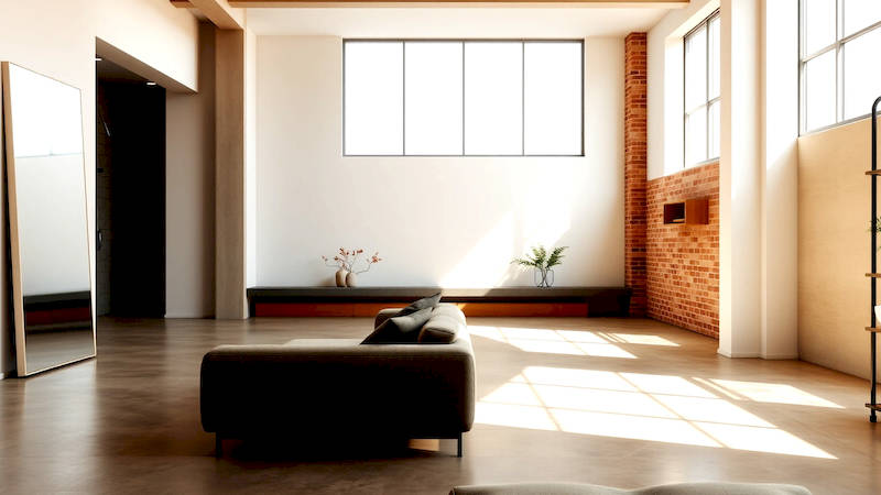
Lighting’s Impact on Neutral Colors: Maximizing Natural and Artificial Light
The way light interacts with your chosen neutral palette is crucial to its success. Natural light will amplify colors and bring out their undertones, whereas artificial light can distort hues and create unwanted shadows. Maximizing natural light is paramount in a minimalist space. Keep windows unobstructed and use sheer curtains to diffuse sunlight without blocking it completely. When considering artificial lighting, prioritize warm white bulbs (around 2700K-3000K) for a cozy and inviting atmosphere.
Layering different types of lighting is also essential. Combine ambient lighting (ceiling fixtures), task lighting (lamps for reading or working), and accent lighting (spotlights to highlight artwork) to create a well-illuminated and balanced space. Be mindful of the finish of your light fixtures – matte finishes tend to create a softer, more diffused light, while glossy finishes can reflect light more intensely. Finally, experiment with dimmers to adjust the intensity of your lighting and create different moods.
Case Study: A Serene Scandinavian-Inspired Living Room
Consider a living room designed with a Scandinavian-inspired minimalist aesthetic. The walls are painted in a soft, off-white with a slight warm undertone. The flooring is light oak, adding a touch of natural warmth. A large, comfortable sofa in a light grey linen fabric anchors the space. Layered on the sofa are cushions in varying shades of grey, ranging from pale to charcoal, and a chunky knit throw in a cream color. A low coffee table made from light wood provides a functional surface.
Artwork consists of abstract prints in muted blues and greens, adding subtle pops of color without disrupting the overall calm. Lighting includes a large pendant lamp with a simple white shade, recessed lighting for ambient illumination, and a floor lamp with a woven shade. The result is a space that feels airy, inviting, and effortlessly chic – a testament to the power of a well-executed neutral palette.
Conclusion: Creating a Sanctuary of Calm
Choosing neutral color palettes for minimalist living rooms is about more than just picking a shade off a paint chart. It’s about understanding the nuances of color theory, the impact of undertones, and the importance of layering textures and tones to create a space that is both aesthetically pleasing and emotionally restorative. By embracing a restrained palette and focusing on quality materials and intentional design choices, you can transform your living room into a sanctuary of calm and clarity.
Remember to consider the existing elements in your space, test paint samples under various lighting conditions, and don't be afraid to experiment with different shades and textures. The key takeaway is that neutrality, when executed thoughtfully, is far from boring. It's a powerful tool for creating a space that promotes peace, well-being, and a truly minimalist lifestyle. Begin by gathering inspiration images, creating a mood board, and identifying your preferred neutral tones. Then, armed with knowledge and intention, embark on the journey of creating a living room that reflects your personal style and supports your tranquil lifestyle.
Deja una respuesta