
How to Use Color Blocking to Define Open-Concept Spaces
The rise of open-concept living has dramatically reshaped modern home design. While these layouts foster a sense of spaciousness and promote social interaction, they often lack the visual definition of traditionally separated rooms. This can leave spaces feeling disjointed or undefined, impacting both aesthetics and functionality. Enter color blocking, a powerful design technique that utilizes bold and strategic use of color to delineate zones within an open plan, establish visual hierarchy, and create a cohesive flow. Beyond simply being a trendy aesthetic, color blocking is a practical solution for a common challenge faced by homeowners embracing open-concept living. It's a versatile tool applicable to various styles, from minimalist and modern to eclectic and bohemian – and understanding its nuanced application can transform a sprawling space into a beautifully organized and inviting home.
This article will delve into the art and science of using color blocking to define open-concept spaces. We’ll explore the psychological impact of color, specific color palette strategies, practical application techniques, and common pitfalls to avoid. The goal is to equip you with the knowledge and inspiration to confidently implement color blocking in your own home, tailoring it to your personal style and functional needs. We will look beyond the superficial visual appeal and examine how discerning color choices can completely alter the perceived size, shape, and overall feeling of an open-concept environment.
Understanding the Psychology of Color and Space
Before diving into specific techniques, it’s crucial to understand the powerful psychological effect colors have on our perception of space. Colors aren't simply aesthetic choices; they actively influence our moods, behaviors, and even our perceived dimensions of a room. Warm colors – reds, oranges, and yellows – tend to advance visually, making areas feel cozier and more intimate. However, overusing warm colors in a large open space can make it feel visually overwhelming or even smaller. Cooler colors – blues, greens, and purples – recede visually, creating a sense of calm and spaciousness. Strategically using cooler tones can make a room appear larger, but excessive use can feel cold or sterile.
Understanding these basic principles is the cornerstone of successful color blocking. It's not just about picking colors you like; it's about leveraging their inherent qualities to achieve a specific effect. For example, using a rich, warm ochre on a feature wall in a living area can visually anchor a seating arrangement and create a defined "room" within the larger space, while a cool grey on the adjacent dining area walls can visually expand that zone, making it feel airy and inviting. Interior designer Kelly Wearstler emphasizes this point, stating, "Color has the power to transform a space, dictate the mood, and create a sense of narrative." (Source: Architectural Digest).
Furthermore, consider the inherent "weight" of colors. Darker shades visually ground a space, while lighter shades lift and expand. Color blocking can capitalize on this by anchoring zones with darker colors and creating a sense of flow with lighter connecting shades. This mindful approach moves beyond aesthetic preference into the realm of architectural illusion, manipulating the perceived boundaries of the room.
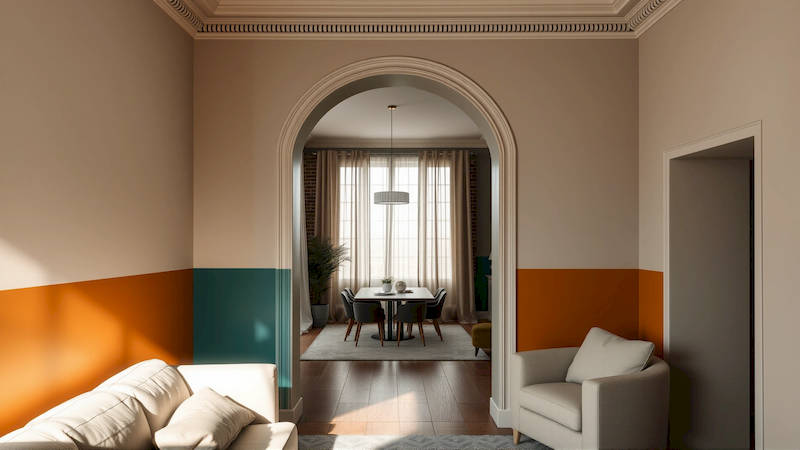
Defining Zones with Strategic Color Placement
The primary goal of color blocking in an open-concept space is to visually separate distinct functional areas. This doesn’t necessitate a complete visual break, but rather a subtle or bold demarcation that clarifies the purpose of each zone. One effective technique is to paint individual walls within the open space with different colors, creating a sense of enclosure where none physically exists. For example, in a living-dining room setup, you might paint the wall behind the sofa a calming blue, while the wall defining the dining area could be a warm terracotta. This visually segments the spaces, giving each a distinct identity.
Another strategy involves "color wrapping," where a single color extends onto adjacent walls and even the ceiling to create a cohesive and immersive zone. This is particularly effective for highlighting a specific area, such as a home office nook. By enveloping the space in a bold, focused color – perhaps a deep teal or charcoal grey – you create a visual separation from the surrounding open areas. This technique not only defines the space but also focuses the mind and encourages productivity. Consider the flow of movement within the open concept space; color blocking should facilitate this flow rather than interrupt it.
Avoid simply selecting colors at random. Map out the intended function of each zone and choose colors that reflect and support that purpose. A vibrant yellow might be perfect for a children’s play area, fostering creativity and energy, while a muted sage green might be ideal for a reading nook, promoting calm and relaxation.
Selecting Color Palettes for Cohesion and Impact
While bold contrasts can be impactful, successful color blocking relies on a cohesive color palette. A jarring combination of colors can create visual discord and detract from the overall design. Begin by selecting a base color, a neutral tone that will serve as a unifying element throughout the space. Consider shades of grey, beige, or off-white. This base color will appear on the majority of the walls and help tie the different colored zones together.
From the base color, choose two or three accent colors that will be used for the color blocking. These accent colors should complement each other and the base color, creating a harmonious overall effect. Explore color theory principles, such as complementary colors (opposites on the color wheel – like blue and orange) or analogous colors (adjacent on the color wheel – like blue, blue-green, and green). Online tools like Adobe Color (color.adobe.com) can be invaluable for generating harmonious color palettes and exploring different color combinations.
A common mistake is to overlook the impact of existing elements like flooring, furniture, and artwork. Ensure that the chosen color palette complements these existing features. Bringing fabric swatches and paint samples home allows you to assess the colors in the actual lighting conditions and see how they interact with your existing décor. Don’t underestimate the power of undertones – even seemingly neutral colors can have warm or cool undertones that significantly impact the overall look.
Practical Application Techniques and Tools
Once you’ve finalized your color palette, the practical application phase begins. Proper preparation is paramount to achieving a professional-looking finish. Start by thoroughly cleaning the walls, patching any holes or imperfections, and applying primer. Primer is especially important when painting over dark colors or applying light colors to dark surfaces; it ensures better adhesion and truer color representation. Invest in high-quality painter’s tape to create clean, crisp lines between the different colored zones.
When applying the paint, use a combination of brushwork and rolling. Use a brush for cutting in along edges and corners, and then use a roller for the larger surfaces. Apply at least two coats of paint, allowing each coat to dry completely before applying the next. For particularly sharp color blocks, consider using a laser level to ensure perfectly straight lines. Or, for a softer, more artistic effect, embrace slightly imperfect lines – a subtle gradient or blending effect can add depth and visual interest.
Remember to protect your floors and furniture with drop cloths. Proper ventilation is also essential, so open windows and doors or use a fan to circulate air. Don't rush the process; taking your time and paying attention to detail will result in a far superior finish.
Avoiding Common Pitfalls and Refining Your Design
While color blocking is a versatile technique, there are potential pitfalls to avoid. Overdoing it – applying too many different colors – can create a chaotic and visually overwhelming space. It’s often better to start with a simpler palette and gradually add more complexity. Another common mistake is failing to consider the lighting. Colors appear different in natural light versus artificial light, so assess your color choices in various lighting conditions.
Don’t be afraid to experiment with different techniques and finishes. A matte finish can create a sophisticated and understated look, while a high-gloss finish can add drama and visual interest. Consider incorporating textures – such as wallpaper or textured paint – alongside the color blocking to add depth and dimension.
Finally, remember that design is subjective. Don’t be afraid to break the rules and experiment until you find a look that reflects your personal style and enhances your living space. Seek inspiration from interior design magazines, websites, and social media platforms, but ultimately, trust your instincts and create a space that you love.
Conclusion: Embracing Color for a Harmonious Open Concept
Color blocking is a powerful tool for transforming open-concept spaces, turning potentially undefined areas into visually distinct and functionally organized zones. By understanding the psychological impact of color, carefully selecting harmonious palettes, and employing precise application techniques, you can create a home that is both aesthetically pleasing and undeniably livable. The principle isn’t just about aesthetics; it’s about creating a functional, emotionally responsive environment that caters to your needs.
The key takeaways are to prioritize cohesion by establishing a base color, strategically use color to define zones based on their intended function, and not be afraid to experiment while paying attention to detail. As a next step, begin gathering inspiration – collect paint swatches, browse design magazines, and create a mood board to visualize your desired look. Most importantly, remember that successful color blocking is about creating a space that feels uniquely you. Consider starting with a smaller, less intimidating zone to build confidence before tackling a larger project, and don’t hesitate to enlist the help of an interior designer if you need guidance. With careful planning and execution, color blocking can unlock the full potential of your open-concept living space, transforming it from a sprawling expanse into a beautifully defined and inviting home.
Deja una respuesta